This is why it took us three weeks to paint our kitchen.
And that three weeks doesn't count the previous two weeks, when squares of green pranced across the wall above the counter, revealing whether they were too bright, too light, too dark, or too blue. No green appeared to be "just right."
I wanted an apple-y bright green kitchen with red accents. Something sort of like this, as far as the colors go, but not so modern:

Here's an inspiration board I created through Polyvore:

Kitchen Inspiration by GloWorm59 on Polyvore.com
I know there are some folks, mostly men, who recoil with horror upon seeing the green on my inspiration board. And I will tell you, I learned that if this was the vibe I wanted in kitchen, the color(s) that I intially thought would provide it was far too flourescent. When I painted the sample square (or three) on the wall, it looked my kitchen might be the studio for an eighties workout video. I pondered mounting black lights under the cabinets. I knew that that was not the vibe I wanted for the kitchen, so I had to figure which way to go on the color wheel.
First, I tried lighter. The pale green I selected looked like a sickly white once up on the wall. Then, I reasoned - if the color I thought I wanted was too bright once it was up on the wall, then I needed to choose a shade that was slightly duller than what I thought I wanted. With this approach, the colors I chose ended up having more of a blue hue than I wanted - more of a sage than an apple.
I was ready to abandon green all together. Could I go back to yellow after swearing it off? Maybe some shade of aqua or teal? Match the dining room with Lilac Whisper? Exhausted, yet determined, I tried one more round of greens. This time, I took the "too blue" greens and looked for something a little more yellow, without getting the whole way to "flourescent."
BINGO! I found our happy medium with two options: Summer Field and Inch Worm. Inch Worm was slightly darker and more blue. I was torn, but since Kevin preferred Inch Worm, we tried it.
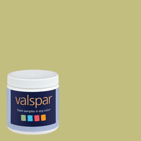 |
| Inch Worm |
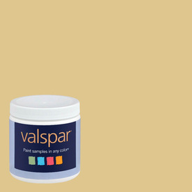 |
| Summer Field |
I know the Summer Field looks almost yellow, but it really was more of a green on the wall.
Over Easter Weekend, my dad helped us put on the first coat. Once it covered the kitchen, we were very skeptical. It was still a little dark and a little blue. Painting halted while we hemmed and hawed for two weeks, trying to decide if we should keep it. We considered switching to Summer Field, and I painted two large sample squares for our consideration.
We ended up deciding that Summer Field looked a little pukey, and that Inch Worm had grown on us enough to try it. Once we did the second coat last weekend and removed the painter's tape, we are finally satisfied.
I learned a lot about selecting a paint color through this process. I've done it before with relatively little trouble, but this was especially challenging. I would say that I took three lessons from all this:
- If you want a bright color, realize that the color that looks as bright as what you think you want might be too bright. Try it anyway, but select a few more subtle samples, as well.
- When selecting samples, start with a few that are quite different. I ended up with almost a dozen samples because I started with about four that were too bright, then two that were too light, one that was too dark, three that were too blue, and then two that ended up being real options. I should have gone with one of each of these categories initially to see what would work, then maybe buy a few more samples within that group.
- If you're unsure about a color, remove the painter's tape and sit with it for a few days. It's amazing how different your impression can be once that blue outline is gone. Also, use your normal lighting so you can get a sense of what it will normally look like.
This isn't the greatest picture, but it can give you an idea:
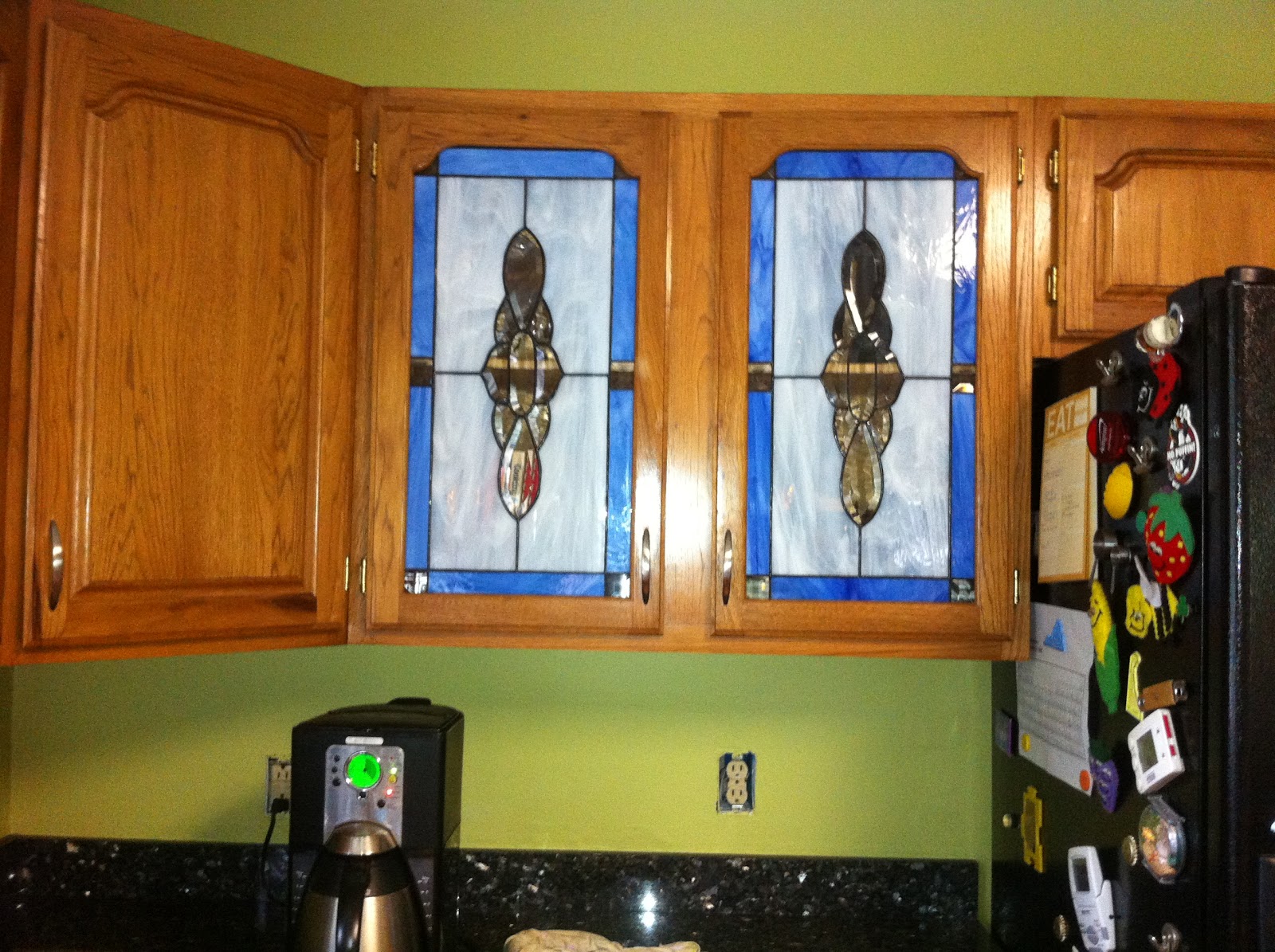
I do plan to replace those stained "glass" windows, as they don't really go with look I'm going for. I'm considering replacing them with punched copper, or hand-painted stained "glass" with flowers that echo the curtains (those flowered ones on the inspiration board). I'm anxious to get it all together so I feel like we can start enjoying our home!
No comments:
Post a Comment
What do you think?